You have 3 seconds to grab the attention of visitors to your website. That’s it. Three seconds. Can you do it?
If you can’t, they will move on to another website and you will have lost your chance to convert that visitor into a customer. So you’ve got to do something to get their attention. That’s the key to improving conversion rates.
Conversion optimization, improving conversion rates is critical to your company’s bottom line. Even small differences in conversion rates can yield big results. For example, if you have 2% conversion rate today, and you can do something to lift that rate to 3%, you’re actually seeing a 50% increase in results!
Conversion optimization techniques are most important to use in your landing pages. The following 10 best practices for improving landing page conversion rates can help you captivate visitors in those crucial first three seconds. All coming from an inbound marketing company in Brooklyn.
1. Test Your Design
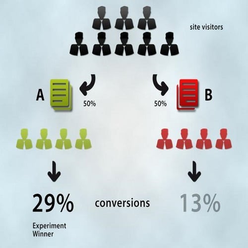
Let’s say you have two different banners, and you don’t know which one will be more appealing. Perform A/B testing (also called split testing) to find out. You create two different versions of the page, each with a different banner. Testing software can direct half of your traffic to one page and half of your traffic to the other. Each of your pages should include a call to action, so you can tell which page yields more conversions. Landing page optimization should be one of your “To do’s” in your digital marketing plan. Use Google Analytics to monitor and optimize results.
2. Scrutinize Your Headline
Advertising legend David Ogilvy said this before the Internet was around, but the principle still applies:
“On the average, five times as many people read the headline as read the body copy. It follows that, if you don’t sell the product in your headline, you have wasted 80% of your money.”
With this in mind, what do your visitors see first? Will their eyes go to something that will keep them there for more than 3 seconds? Create several different headlines and then test them just like you test your layout.
Try our new Children’s vitamins now – 50% discount this week!
Give your chilld our new children’s vitamin formula. She will thank you for it.
3. Examine Your Layout and Navigation
Can visitors find what they’re looking for quickly? Is it difficult to find your contact information? Attention to your layout and navigation can direct your visitors focus to your most important elements, such as your call to action. Put your most important features toward the top of your page, and make it easy for visitors to access information.
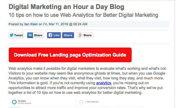
4. Keep Text Short and Snappy
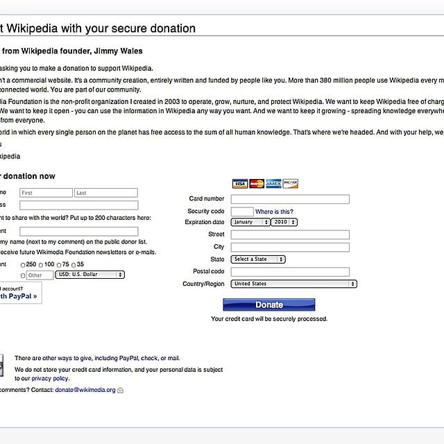
Let’s face it. Quick communications have decreased our attention spans. We see large blocks of text and our eyes glaze over. Don’t let this happen to your visitors. Keep your text as short as possible while still conveying your message. Get a good editor, if necessary, but boil things down to their essence. The example below shows how Wikipedia tested long and short text segments when soliciting donation from users.
5. Get Visual
Visually appealing content garners more clicks, so invest in creating images and layouts that are unique, attention-getting, and brand-appropriate. It’s important to stay true to your brand with your images, so choose them with care so they contribute to your branding and don’t distract or confuse.

6. Include a Clear Value Proposition
What’s in it for them? A visitor to your website should know within just a few seconds what value you bring to their lives. You can do this by telling potential buyers what is special about your service or product and why it’s different or superior to every other similar service or product on the market. The company below talks abour premium services, professional team members and affordable prices. Three aspects of the moving industry service that are important to their audience.

7. Enlarge Call-to-Action Buttons
If visitors don’t quickly notice your call-to-action buttons, they may lose interest and move on. You can pull their vision to your buttons by enlarging them and creating contrast. Make them a color that is very different from the background (a blue button on a white background, with the text “Get Free SEO Analysis Now!” for example).
8. Use Video to Humanize Your Brand
Video has taken the Internet by storm. In a sterile digital world, video brings a human element to the medium and helps us to relate to one another. Finding a way to use video can keep people on your site long enough to convert. Be smart and creative with your video choices. Don’t use video just to use video. Make it applicable: a product demo, a how-to tip, etc.
9. Add a Guarantee
People are more likely to buy when the risk is as low as possible. Including a no-questions-ask return policy can increase your conversion rate, especially if the guarantee is prominently featured on your website.

10. Test Again Regularly
Once you’ve made changes to your website, test it again. In fact, test regularly. As trends change, people look for different things, and you will need to update your website from time to time in order to keep your conversion rates on the rise.

Remember that you only have 3 seconds to hook them and show them that you have exactly what they need. Consider these 10 best practices. Contact us to learn more about how you can improve your conversion rate in those critical 3 seconds.


